Website accessibility: what it means, who it helps, and how to check your own site
An accessible website works for people who can't see the screen well, can't use a mouse, or can't hear a video, and it works better for everyone else too. Here's what the standard asks for, and checks you can do yourself in an hour.
Picture a few of the people who might visit your website today.
Someone who is blind, listening to the page through a screen reader that reads the text aloud. Someone with a tremor who can’t use a mouse precisely and moves around with the keyboard. Someone who is hard of hearing, watching your video without sound. Someone with a broken wrist, using one hand. Someone reading on their phone in bright sunlight. Someone older, who has turned the text size up.
An accessible website works for all of them. That’s what accessibility means on the web: making sure people can use your site whatever their abilities, and whatever the circumstances they’re in.
Why it matters
It’s a lot of people
The World Health Organization estimates that 1.3 billion people, about one in six people worldwide, experience significant disability (WHO fact sheet, Disability and health (external site), March 2023). That’s before counting temporary difficulties like an injury, or situations like a noisy room or a cracked screen, and before counting the gradual changes in sight, hearing and movement that come with age.
If your site is hard to use for these people, they’ll go somewhere else, and many won’t tell you why.
It makes the site better for everyone
Almost everything that helps disabled people helps everyone else too:
- Clear headings and plain language help anyone who’s skimming or reading in a second language.
- Good colour contrast helps anyone reading in sunlight or on a cheap screen.
- Captions help anyone watching without sound.
- Large buttons help anyone using a phone with one hand.
- Forms that explain errors clearly help everyone fill them in.
Accessible sites also tend to be better understood by search engines, because the structure that helps a screen reader also helps a search engine make sense of the page.
It’s increasingly a legal requirement
In many places, the law requires some organisations’ websites to be accessible. The details depend on where you operate and who your customers are. For example, the European Accessibility Act (external site) has applied since 28 June 2025 to many products and services sold to consumers in the EU, including e-commerce. We’re not lawyers, and this isn’t legal advice, but if you sell to customers in other countries it’s worth checking what applies to you.
The standard: WCAG
The standard most people refer to is the Web Content Accessibility Guidelines (WCAG), published by the World Wide Web Consortium (W3C), the body that sets web standards. The current version, WCAG 2.2 (external site), was first published in October 2023.
WCAG is organised around four principles. Content must be:
- Perceivable: people can see or hear it, or both. For example, images have text descriptions and videos have captions.
- Operable: people can use it with whatever they use to navigate, whether that’s a mouse, a keyboard, a touch screen or a switch.
- Understandable: the text is clear, the site behaves predictably, and errors are explained.
- Robust: it works with the browsers and assistive technologies people actually use.
Each principle contains specific, testable requirements called success criteria, graded in three levels: A (the minimum), AA and AAA (the highest). Level AA is the level most laws and policies point to, and it’s the sensible target for almost every website. It’s the level we build to.
What WCAG 2.2 added
WCAG 2.2 added several requirements that are worth knowing about, because older sites often miss them:
- Focus not obscured: when you move through a page with the keyboard, the item you’re on mustn’t be hidden behind something like a sticky header or a cookie banner.
- Target size: buttons and links must be big enough to tap, generally at least 24 by 24 CSS pixels, or have enough space around them.
- Dragging movements: anything you can do by dragging, you must also be able to do another way, such as tapping.
- Consistent help: if you offer help, such as a contact link or chat, it should be in the same place on every page.
- Redundant entry: don’t make people type the same information twice in one process.
- Accessible authentication: signing in mustn’t depend on remembering or transcribing things, such as solving a puzzle, unless there’s an alternative. Allowing people to paste passwords and use password managers helps meet this.
Checks you can do yourself
You don’t need special training to find many accessibility problems. Set aside an hour and try these on your own site. You’ll probably learn a lot.
1. Put the mouse away
Using only the keyboard, press Tab to move through the page, Shift + Tab to go back, and Enter or Space to activate things.
- Can you reach every link, button and form field?
- Can you always see where you are? There should be a clear outline or highlight on the current item.
- Does the order make sense, roughly following the layout?
- Can you open and close menus, pop-ups and dialogs, and get back out of them?
- Is there a “skip to content” link, so you don’t have to tab through the whole menu on every page?
If you get stuck or lost, so will anyone who relies on a keyboard.
2. Zoom in
Zoom the browser to 200%, then 400%. (On a computer, press Ctrl and +, or Cmd and + on a Mac.)
- Is all the text still readable, without being cut off or overlapping?
- At 400%, can you read everything by scrolling only up and down, without scrolling sideways?
- Do menus and buttons still work?
3. Look at the images
For each meaningful image, ask: if you couldn’t see it, what would you need to know? That’s what its text alternative (the “alt text”) should say. Your developer or content management system should let you see and edit it.
- A product photo needs a description of the product.
- A photo of your team at work might say what they’re doing.
- A chart needs its key finding described in text.
- An image that’s purely decorative should be marked as such, so screen readers skip it.
- Images of text are a problem; the text should be real text.
4. Check the colours
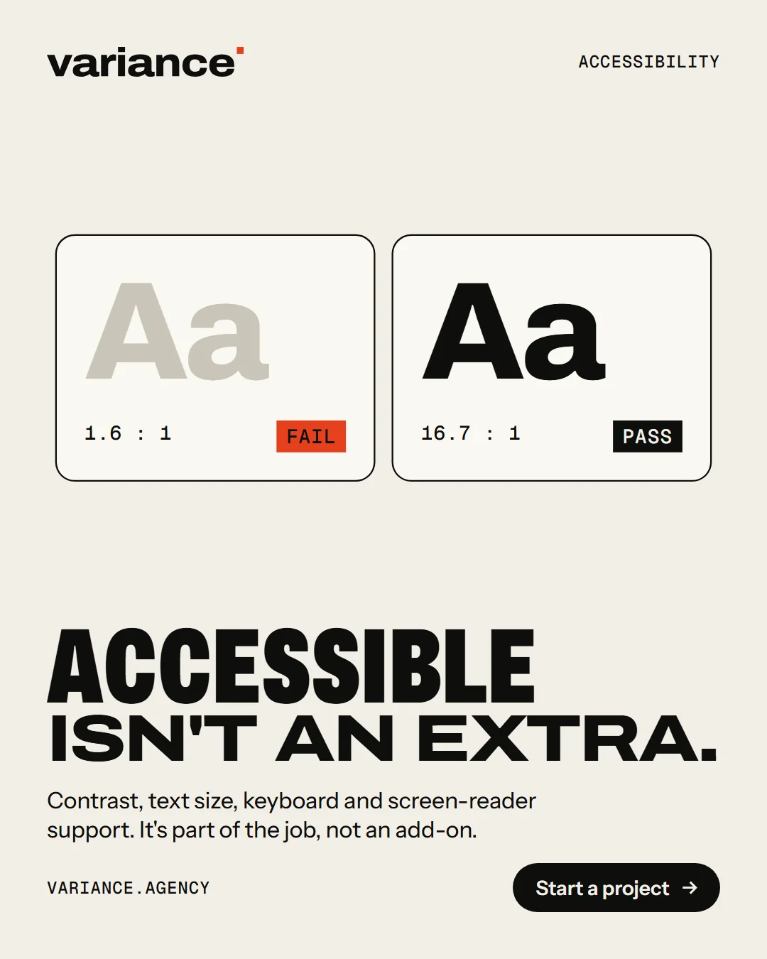
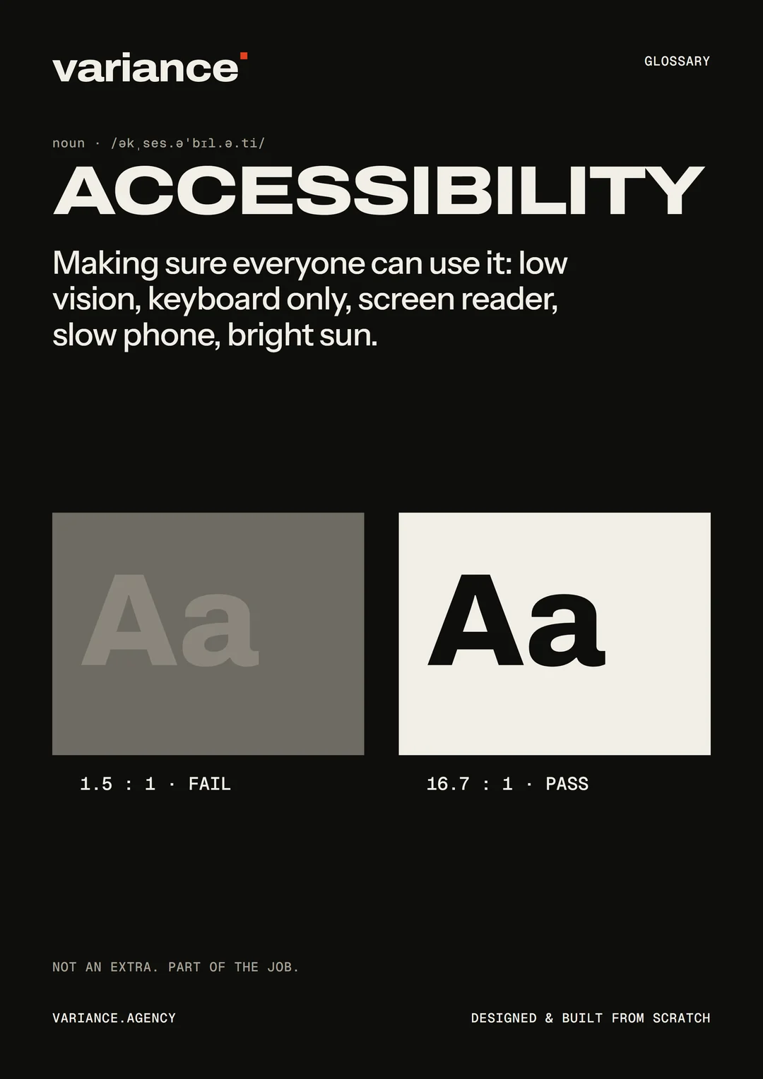
Text needs enough contrast against its background. WCAG AA asks for a contrast ratio of at least 4.5:1 for normal text and 3:1 for large text. Free tools like WebAIM’s contrast checker (external site) tell you whether two colours pass.
Also check that colour isn’t the only way information is shown. A form that only marks errors in red, or a chart that only uses colour to tell lines apart, is hard for people with colour blindness.
5. Look at the structure
Headings should work like an outline: one main heading for the page, then section headings beneath it, in order. They should describe what follows. A screen reader user often jumps from heading to heading to find what they need.
Link text should make sense on its own. “Read our pricing guide” is clear; “click here” isn’t, especially when a screen reader lists all the links on a page.
6. Fill in a form, badly
Try your contact form or checkout, and make mistakes on purpose.
- Does every field have a visible label (not just placeholder text that disappears when you type)?
- When you make a mistake, does the form tell you clearly what’s wrong and how to fix it, next to the field?
- Is the error explained in words, not only by a red border?
- Does what you’ve typed survive the error, or do you have to start again?
7. Watch and listen
- Do videos have accurate captions?
- Does anything play sound automatically? If so, can it be stopped easily?
- Does anything move, flash or scroll by itself? People should be able to pause it, and motion should be reduced for people who’ve asked their device for less motion.
8. Try a screen reader
This takes a little practice, but it’s eye-opening. Most devices have one built in: VoiceOver on Apple devices, TalkBack on Android, and Narrator on Windows. The free NVDA screen reader is also widely used on Windows. Turn one on and try to find your prices or contact details with your eyes closed.
9. Run an automated check
Free tools can find some problems automatically. Try WAVE (external site) or the Lighthouse accessibility report in Chrome’s developer tools.
Automated tools are a useful start, but they can only catch some problems. They can tell you an image has no alt text, but not whether the alt text is any good. They can’t tell you whether the keyboard order makes sense or whether a form is confusing. A site that passes every automated check can still be hard to use. Manual checks, and ideally testing with disabled people, are what complete the picture.
A word about accessibility overlays
You may be offered a plugin or “widget” that promises to make your site accessible with one line of code, often with a floating accessibility button. Be cautious.
These tools can’t fix problems in the underlying site, such as a form that doesn’t work with a keyboard or images without meaningful descriptions. Many disabled people and accessibility specialists have spoken out against them, and some find they get in the way of the assistive technology they already use. Accessibility comes from how the site is designed and built, not from a layer added on top.
Making accessibility part of a project
Accessibility is cheapest when it’s part of the work from the start, and most expensive when it’s bolted on at the end.
In the quote. Ask for the standard in writing: “The site will meet WCAG 2.2 Level AA.” (We cover other things to ask in What a website quote should include.)
In the design. Colours with enough contrast, text that’s large enough, clear focus styles, generous touch targets, and layouts that reflow on small screens and at high zoom.
In the build. Proper headings and structure, real buttons and links, labelled forms, keyboard support for everything, and respect for people’s settings, like reduced motion and larger text.
In the content. Plain language, descriptive headings and links, meaningful alt text, and captions for video. This part carries on after launch, so your team needs to know how to do it. A good content management system helps, for example by asking for alt text when an image is uploaded.
In testing. Automated checks on every change, plus manual keyboard, zoom and screen reader testing before launch.
After launch. Accessibility isn’t a one-off. Every new page, image and feature can add problems, so it’s worth checking again regularly.
Beyond the website
Accessibility applies to everything you publish, not just web pages:
- PDFs. A menu, brochure or form published only as a PDF is often hard or impossible to use with a screen reader, and awkward to read on a phone. Where you can, put the information on a web page as well. If a PDF is necessary, create it from a properly structured document with headings and real text, not a scan.
- Emails. Newsletters built from one big image can’t be read by screen readers, and show nothing when images are blocked. Use real text, with alt text for the images.
- Social media. Most platforms let you add alt text to images and captions to videos. Put the important information in the text of the post, not only in the image.
- Mobile apps. The same principles apply. Apple and Google both publish accessibility guidance for apps, and both phones include screen readers and text size settings that apps should respect.
- Documents you send customers. Quotes, invoices and contracts are easier for everyone when they use clear headings, readable text sizes and good contrast.
An accessibility statement
Many organisations publish an accessibility statement: a page saying what standard the site aims for, any known problems, and how people can report difficulties or ask for information in another format. It’s a sign you take it seriously, and it gives people a way to tell you when something doesn’t work. When they do, thank them, and fix it.
Questions to ask your developer
- What accessibility standard will the site meet? Will that be written into our agreement?
- How will you test it? Automated tools only, or keyboard and screen reader testing too?
- Will our team be able to add alt text and captions easily?
- How does the site handle zoom, larger text and reduced motion settings?
- Do you use any accessibility overlay or widget? (The best answer is no.)
How we approach it
At Variance, every website we build aims for WCAG 2.2 Level AA. We check it automatically as we build, test with the keyboard, zoom and screen readers before launch, and set up the content management system so your team is prompted for alt text and other essentials.
If you’d like to know how your current site does, ask us. We’ll run through the checks above and tell you plainly what we find.